Skip to content Basic Flexbox
flex-basis
Flex trouble shooting
- Start from a screen size 1200px.
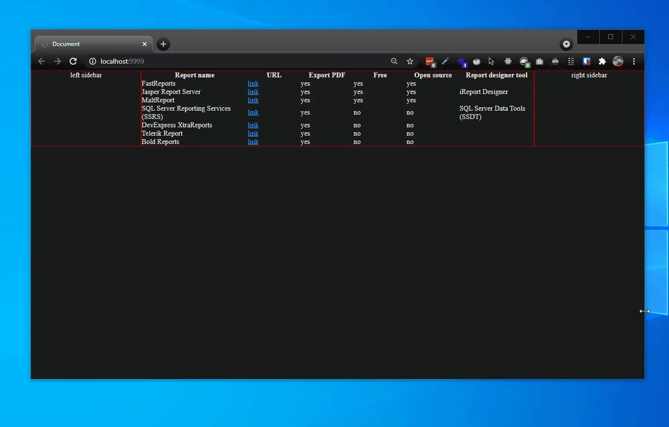
- Left and right sidebars take 500 px, then main content has available space more than minimum 600px of child content (assume we have table child item.
- The main content grows to fit available space. It ends up 700px. (1200 - (2* 250))
- Next, on a smaller screen 1000px width.
- We need at least 1100px, left sidebar 250px + table 600px + right side 250px.
- No width or min-width of main content which is a flex item. A table forces main content flex item to expand and get browser to have page scroll x.
- The main content width is set to 600px which is the same width as a child content (table).
- After, setting min-width 1% to main content on 1000px screen size.
- The main content has set width to available space which is 500px and not expand to 600px because we only has flex shrink on it.
- Table has width 600px as a minimum width (sum of 100 min width of 6 columns) and show scroll-x at wrapper div of it.